« Successful Companies | Back to Home | User Generated Content »
October 10, 2005 Burrito is the New Black
A little while ago Max told Sergio and I that he felt the ideal user interface for Slide would be like a burrito: satisfying, but not overly sophisticated. I suspect there is a widespread fear that a website that feels "designed" won't appeal to a consumer market. Tapan Bhat--formerly a Director of Product Management at Adobe, now at Yahoo!--once told me "Don't be afraid to be ugly. People like ugly." This is the essence of burrito design.
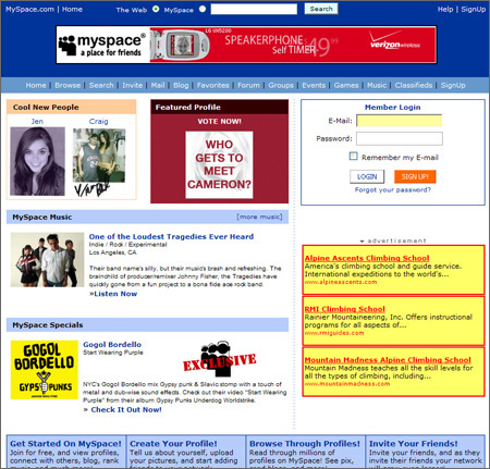
Many companies have been successful without paying much attention to design. Indeed, many embrace the notion of anti-design. They're proud of their ugly, busy websites.
If Myspace
wanted the typographic elegance Eris Free is able to acheive
it could hire her to help them (okay, technically she's at Apple now, but there are other people they could hire). But that's not what they're interested in.
That said, I believe Max is wrong. Giving away burritos is great, until a competitor comes along giving out filet mignon.
As Jeffrey McManus, who works at Yahoo!, describes from a session he attended at Web 2.0 called "What Teens Want":
"None of them use Yahoo for much of anything (not for IM, not for search, not for shopping, not for mail) except as a sort of second-chance search when Google didn't give them what they wanted. They hate the Yahoo home page because it's busy and weighed down with ads, no surprise there."
By the way, if you're interested in helping Sergio and I at Slide figure out how to make the filet mignon, please get in touch with one of us. We need someone full-time in San Francisco. It would help if you were good with JavaScript and were interested in techniques like those in Donovan's LivePage.
Posted by johnnie at October 10, 2005 12:30 AM
Comments
I believe the "Burrito" effect that at least myspace is trying for is on purpose to invite others to tweak their own home pages. If the myspace site looks amazing people aren't going to feel comfortable displaying their cheesed version.
Winamp did this when it first came out, it's default skin was pretty much sucktastic and that really prompted almost everyone to create their own skin to improve on it. You could always say, even with the worst skin, "at least it's better than the default."
As an aside, to make Slide rock remember it's design should be almost non-existant. People want their pictures to shine on the pages, not the website. The website should almost be invisable.
Posted by: Shawn Oster at October 19, 2005 12:22 PM
I hadn't thought about it that way. I must say I love hitting people's pages on MySpace with the Snoop Dogg wallpaper and Lil Kim video playing. It's not aesthetically pleasing to me, but it feels like a human being, complete with peculiarities, rather than a sterile corporate website. I agree that sites like Slide and MySpace are well designed only if they let people express themselves.
One thing Max pointed out to me (I'll speak on his behalf until he posts something on his site) after he read this post was that he is concerned if someone spends too much time on something before really understanding what people want. To stretch my previous analogy further (I feel like Friedman at this point), think about someone spending weeks preparing a large meal of delicious steaks only to find out that everyone who showed up is vegetarian. It would have been better to spend a couple hours making a wide variety of simple appetizers for people to try, see which they preferred, and slowly over time plan out your big menu. I have to say I agree with his point. You need to get something in front of people as quickly possible, and iterate from there.
Posted by: Johnnie Manzari at October 19, 2005 11:27 PM
It's great that everyone acknowleges that highly designed and cold-looking websites aren't appreciated by web visitors any more than cluttered, busy, ad-laden sites. The key seems to be allowing the user to have a hand in the design, either by giving them their own space, or supplying lots of ways to give an opinion (via blogs, etc.). It's a lot harder to do, if you come from the "old school" of authoritarian publications - that is, the website as electronic magazine mode. You can't just put something out there that smells corporate. Between the user and the web designer, a compromise has to be worked out. It's a shame that a site like Yahoo! would need to go to a conference to hear that younger people like Google's design a lot better.
That said, there is room out there for sites that look beautiful, that emphasize design, or that are pretty much static. Those sites may be best for an older, more traditional reader. It could be that the site's content is a literal presentation of print matter, so staying static is a good thing. Some corporate sites have a legal purpose in mind, so they don't have to be appealing, as much as they have to fulfill a legal obligation. At any rate, such sites aren't meant specifically for a teen or 20-something reader.
Posted by: Ann Clark at November 3, 2005 01:34 PM
Hello, I'm 15. I agree comletely with a lot of what you say, and I just wanted to put down some of my thoughts.
On my myspace, It is very simplistic because I don't know how to do a lot of the things you were talking about like making a pic part of your bg or make a music video play, and I think the majority of the people my age don't know how to either.
The reason it's hard for the elegantly designed website(like the one above) to appeal to a young crowd is because for example, the one above's font color for the links and etc. is too light and makes you have to strain your eyes to read it.
Posted by: Mark Pelusi at November 19, 2005 10:49 AM
You know I'm ablolutely sure that all ingenious is simple. And that's the class of the designer to make it as simple as possible for users together with great appearence.
Posted by: Helen, web designer at December 3, 2005 02:20 AM
Under-designed sites will always appeal to the masses because they are not intimidating to anyone. As a user, you feel like you really own it when the design is lame. If the design is sharp, it may appeal to some, but make others feel less comfortable.
It is why dive bars are always more popular, and usually more fun.
I think this is true of any popular community site, from slash-dot, to Use Groups, and even email listserves. People feel like they own the place, and not like they have to tiptoe around someone else's white-carpet living room.
Design is pretty, but it usually gets in the way of community.
By the way, I'm a fan. 'Burrito Design' will be side-referenced next time I discuss 'Dive Bar Design'
Posted by: Derek Lomas at January 16, 2006 02:52 PM
I like and agree with your burrito to filet mignon comparison. Another way to take that a step further would be to consider how many burritos Taco Bell sells compared to how many filet mignons Morton's sells. And for the price of one Morton's filet, you could buy 20 Taco Bell burritos. Different scope, different market, different price tag.
Posted by: Michael Tupper at July 3, 2006 08:15 PM


