

Print Projects
|
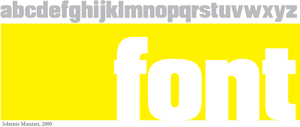
Font: a postscript textface Johnnie Manzari Design corporate font, Aug 2000 Working on some business cards at one point I realized that what I needed was a a sans-serif textface that is able to hold its form when scaled to large sizes. Font was created to do just that by maintaining bold, simple strokes that are favorable at larger point sizes. The problem with fonts like Myriad and even Helvetica to a certain extent was that they weren't heavy enough for the job. Helvetica Bold is probably the closest you can get to what I wanted which explains why it's used so frequently on big signs. Font was developed using Adobe Illustrator 8.0 and Macromedia Fontographer 4.1. |
Motion Projects
(require the Flash 5 or equivalent plug-in)

|
Using the principle of natural logarithms to easily and elegantly replicate organic patterns, this piece uses e (sometime referred to as Euler's Number) to generate a cyclical expansion and compression of bars in conjunction with a recorded sound of Angela Acosta breathing. Angela and I worked on this piece together. |

|
Using several nested algorithms, this piece creates movement that is infinitely unique. |
|
The week after I filmed this clip, these flowers were torn out and replaced with other flowers. When you charge over $8000 a quarter in tuition, you can afford to tear out perfectly good flowers. |
|
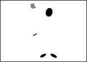
Using 5 dots, I depicted a man smoking. The cyclical nature of the act maps well to this presentation. |
|
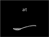
A paradoxically incorrect personal statement about art and design. |